I was in the audience for "Implementing UI Designs in Interface Builder" at WWDC, where Apple touted UIStackView as a new, better way to lay out your views that in a lot of cases didn't require Auto Layout.
While the presentation looked good, I wasn't quite sure this solved a real problem, as the required constraints weren't too complicated to build in the first pace. However, after I found some time to play around with UIStackView, I'm convinced. This view is very, very powerful and can make building common UIs a lot simpler. Take, for example, a number grid:
1 2 3 4 | |
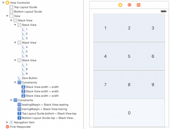
It would take a while to build this kind of UI in Auto Layout. You would have to create constraints between individual labels, make the labels the same size everywhere, make the spacing between all the labels equal, and avoid hardcoding any numbers to keep the whole thing adaptive. This can be a tedious process in Interface Builder, but imagine you're building this in code. It would take forever, especially after debugging your UI.
With UIStackView, doing all of this takes about 30 seconds. After dragging out all the labels, you just need to embed every row in its own stack view. Set the distribution (in code that's UIStackViewDistribution) for these stack views to "fill equally" (.FillEqually), then embed all four stack views in their own stack view.

The top-level, vertical stack view should get top/leading/trailing/bottom space to its superview (or the layout guides), the 4 horizontal stack views an "equal width" constraint to their superview. Finally, center the text of the individual labels (you can select all labels at once and do this with 1 action). Done - that's it.
But it gets better. Say you want to conditionally show or hide the 0 label at the bottom. I don't know why you would want that, but just go with it 😛
To do this, all you have to is toggle the hidden property of that label. The containing stack view will automatically reposition its subviews. If you put that line in an animation block, it will reposition its subviews in an animated fashion.
That last part is a very welcome feature for developers that work with a lot of dynamic views. Instead of creating redundant constraints with lower priorities, removing views from their view hierarchies, and re-adding the view and all its constraints if the new views needs to be re-shown, you can simply toggle hidden instead.
As more people get their hands on UIStackView I'm sure it will show off more of its powers, but needless to say I'm sold. Too bad I can't use it for a while...