Note
This article was written by me but originally published on the Lyft Engineering Blog.
At Lyft we’re in a unique position: every day we work on an app that affects people in the real, physical world — not just the digital one. This has an especially large impact on visually impaired users, because our app is easier to use than the real world alternatives — navigating a train station or queueing up at a taxi stand. Lyft aims to make a product that is accessible and easy to use for all of our users.
Accessibility at Lyft
If an app uses Apple’s standard controls and UI elements, it will likely already work well with VoiceOver; however, Lyft’s UI deviates enough from standard controls such that we don’t get that benefit out of the box. Another complication is that many portions of the app are controlled by the server, including a lot of the text for buttons and labels. Making these UI elements compatible with VoiceOver often requires tweaking them manually, even if we use native controls.
Since we try to keep all of our UI-related code in Interface Builder, and
VoiceOver is just another form of UI, we have written a simple UIView
extension that allows us to enable accessibility on most of our UI directly from
Interface Builder. In this extension, we add 2 properties to UIView:
accessibilitySources: AnIBOutletCollectionofUIViewsaccessibilityFormat: a simple string that represents the format of the accessibility label, which is subsequently passed toString(format:). Every occurrence of%@in this string will be replaced with the next element of theaccessibilitySources, and[self]will automatically be replaced with the current view’s accessibilityLabel.
We can ctrl + drag UI elements into the accessibilitySources, and by marking
accessibilityFormat with @IBInspectable we can specify the string and the
sources all from Interface Builder, keeping the code clean and to the point.
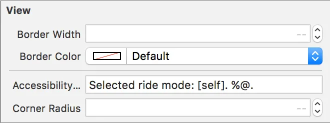
For example, we have an accessibility format on the UILabel that displays the selected ride mode:

[self] is replaced by the accessibility label, which for UILabels is the
text of the label itself. %@ is replaced by an accessibility source, which we
can set up like this:

By disabling the accessibility label for the subtitle, the top label’s accessibility label will read “Selected ride mode: Line. Carpool, 2 people maximum.” without touching any code at all.
Changing the process
As we ramped up our VoiceOver efforts, we wanted to assess whether the changes we made had a meaningful impact to end-users. As developers, we’re too familiar with our own apps to make an honest call about their usability, and when it comes to visual impairment, even a standard usability review could brush over things that would be challenging to a blind or a visually impaired user.
This is why we’re working with a dedicated accessibility expert, himself a native VoiceOver user, to constantly validate our work. All the feedback we’ve been getting from VoiceOver users have further motivated our investment in accessibility. We have optimized VoiceOver in the main flows of our app, and we run weekly regression tests to ensure consistency and stability. Our VoiceOver user also works directly with QA engineers, to let them know what he is looking for and what is missing.
Over the last few months, we have made many improvements in various parts of our app, but also in how seriously we take VoiceOver-related bugs: we block new releases if VoiceOver users experience bugs when going through a ride. All new features are expected to be optimized for VoiceOver from the start, and we are working hard to optimize existing features as well.
We think of accessibility as part of the user interface, just like labels, buttons, and text fields. By having our developers implement support for VoiceOver as part of the initial feature, our visually impaired users will be able to use these features as easily as our regular users.